Have you ever wondered how the colours you use in your home affect your mood and emotions? It’s a fact that the colours you choose can make a huge impact on your overall well-being. So, if you’re planning to revamp your living space, it’s important to carefully consider the colours you use in your design.
While the monochrome scheme is a classic choice, why not try something new and exciting? Enter the analogous colour scheme – a recent trend in interior design that’s taking the world by storm. Also known as the harmonious colour scheme, it creates a stunning bold look for your home.
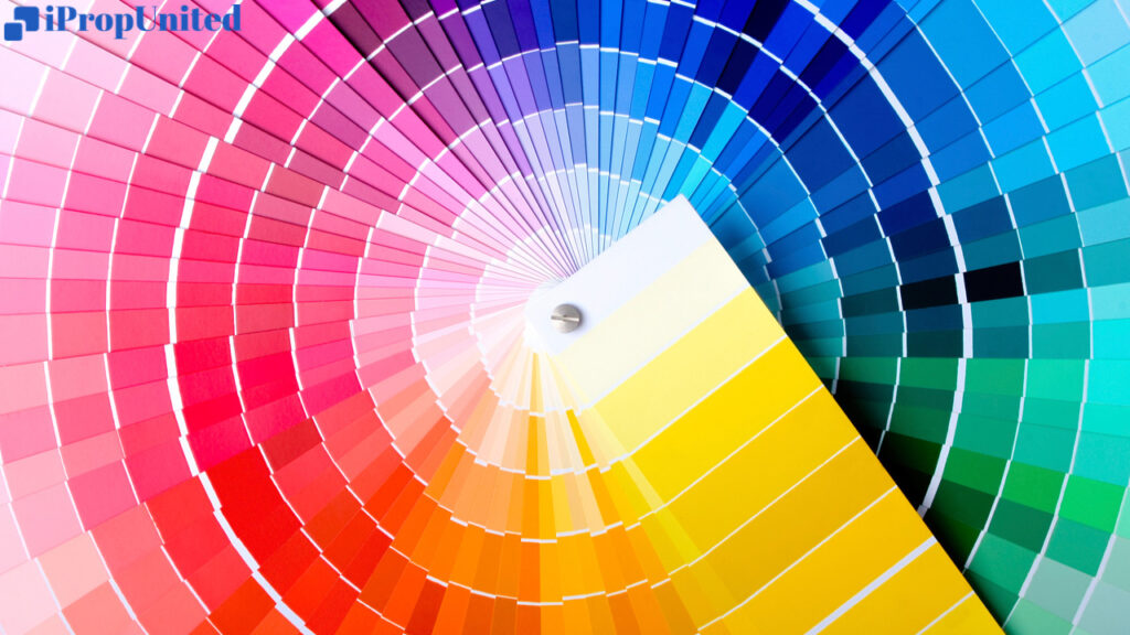
What are analogous colour scheme?
It’s a combination of two or three colours that sit next to each other on the colour wheel. These colours are similar in pigment and intensity, but each one has its own unique quality. When used together, they create a harmonious and calming effect that will leave you feeling relaxed and at ease.
How to create an analogous colour scheme?
It’s easy! Start by choosing a dominant colour – it could be a primary or secondary colour. Then, select a supporting colour that complements the dominant colour and adds texture to the space. Finally, add an accent colour that contrasts with the other two, but still blends in with the tonal range.
Analogous colours examples
Analogous colours are like BFFs in nature. For instance, when the sun sets, it paints the sky with red, yellow, and orange hues, which is a perfect example of this colour scheme. You can also spot this scheme in the changing colours of leaves in fall or flower petals.
When you pick a colour palette, make sure it goes with your home decor. Since these colours are tonal, you can design the space while considering the bigger picture instead of just focusing on a single bright element in the room.
Here are some common analogous colour sets you can use:
- Cool neutrals: If you can’t decide on a single colour, this is the way to go. You can use brown, cream, and grey to achieve this type of analogous colour scheme.
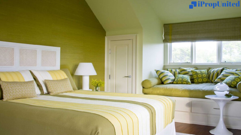
- Earthy tones: These colours are present in nature, like in the changing colours of fall leaves. You can use a dark shade of orange and gold to create a warm and cosy feeling. To neutralize the scheme, you can use brown or tan for a restful look.
- Soothing hues: These colours create a sense of relaxation and calmness. You can mix shades of blue with ivory or tan to give the room a clean and simple look.
How to use analogous colours in your home?
Don’t worry about following any strict rules or restrictions – you can use analogous colors however you like. But, if you’re looking for some tips to help you get started, here are a few that might come in handy:
Consider 60-30-10 rule
It’s a great way to achieve a balanced look that’s visually appealing. To apply this rule, simply use your base color for 60% of your room, your accent color for 30%, and a pop of color for the remaining 10%. This will help your space look more harmonious and put together.
Use only two or three colors to avoid overdoing
This will keep your space from looking too chaotic or busy. Also, make sure the colors you choose are next to each other on the color wheel to maintain the analogous theme.
Decide mood
Deciding on the mood you want to set for your room is also important. Warm colors like oranges and yellows can create a more dramatic, energizing feel, while cool colors like blues and greens can make your space feel more serene and cozy.
Create contrast
Creating contrast is key when working with analogous colors. Make sure to play around with dark and light shades to add interest and depth to your space. You can also use prints and textures to make your space more visually appealing.
Final thoughts
Working with analogous colors can be a lot of fun and create a beautiful space. Just remember to keep it simple, use your creativity, and have fun with it!
Follow and Connect with us: Twitter, Facebook, Linkedin, Instagram


")


 in Modern Business")